
Challenge
Design a logo and packaging for a new brand of France-inspired, Vermont-based artisanal sheep cheese for Gen Z and Millennial cheese enthusiasts.
Market
Gen-Z
Food enthusiasts who appreciate artisanal and high-quality products.
Health-conscious consumers who prioritize natural and locally sourced ingredients.
Individuals who value sustainability and ethical business practices.

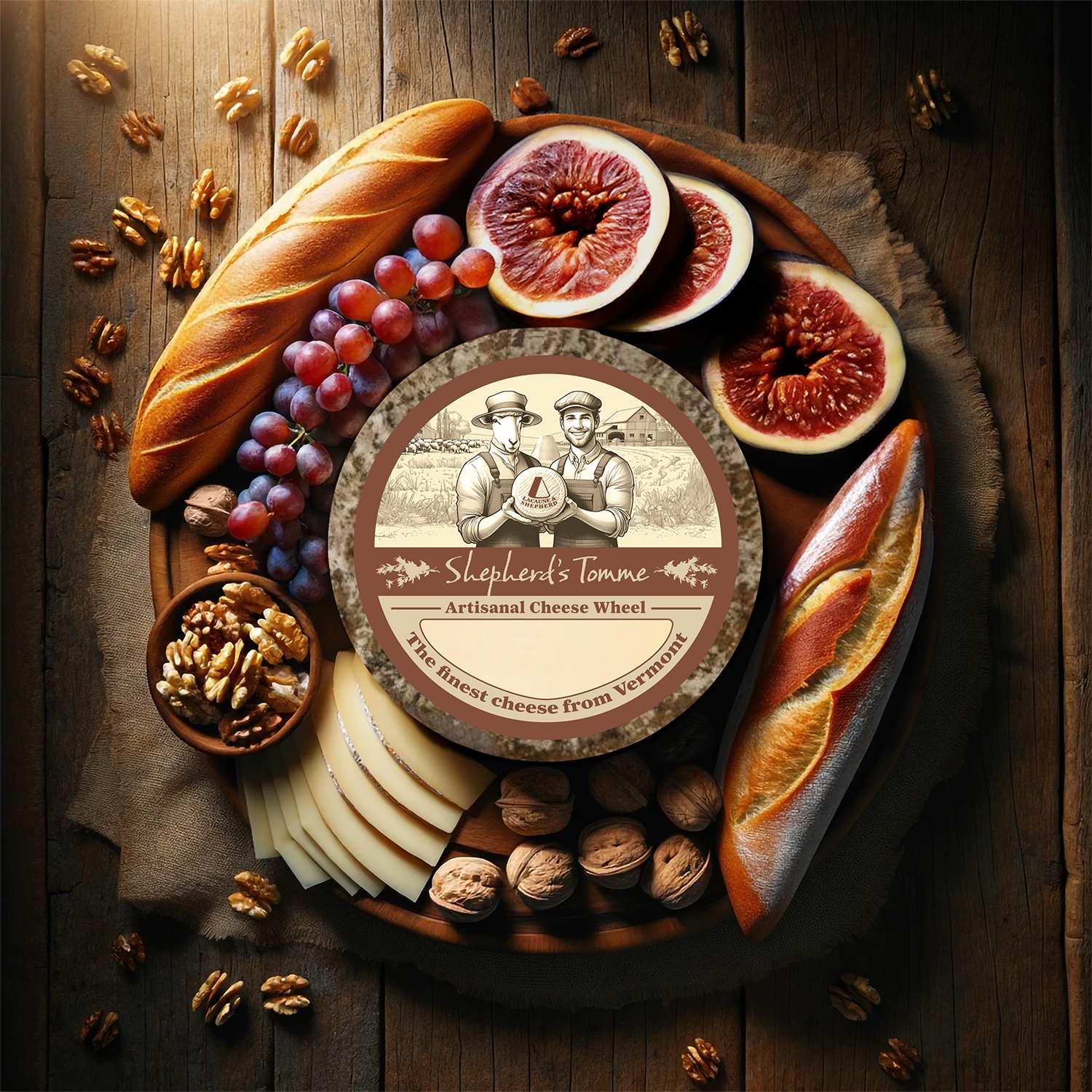
Logo
Simple, matching the shape of a block of artisanal cheese.
Typography
Main: Farnham Headline Bold - Serifs to hint at tradition, with varying stroke widths to communicate hand-made, with sharp inner edges modified to communicate a more friendly brand.
Sub-Type: Baka Too Regular - Script font to convey a hand-made signature on each package

Color Palette - A color palette to match the open range of a Vermont dairy farm.

It became evident through research that the quality of the sheep’s milk was crucial to producing the best possible cheese. This was affected by the sheep’s genetics, diet, physical health, and ability to roam free on the farm. Thus, the sheep plays more than an integral role in the cheese making process...it plays an equally important role in artisanal cheese-making as the shepherd does. Thus, Lacaune and Shepherd was the perfect name to go with, representing both sheep and human.


People who most enjoy artisanal cheese are fascinated by the rinds and consistencies of the cheese. This is why the outside of the packaging shows the texture of the rinds and the textures of the cheese-y interior.


